Color Schemes
This blog posting is in response to a facebook follower’s question:
How do you tastefully layer colors on a table?
When designing tablescapes I use the basic color theory as a guide. This web site will explain color theory in depth.
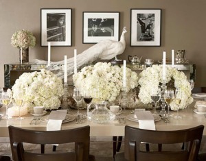
Here is an example of a monochromatic color scheme. I found this photo on a great web site, Apartment Theory.
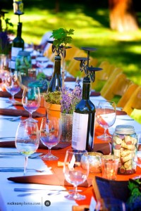
 This photo from a wedding of mine uses orange, brown, green, purple and silver. Don’t be afraid of too many colors on a table, just make sure they all ‘make sense.’ For example, this table has four different hues of green with the wine bottles, grapevines, vintage mason jars and moss. I would think this is almost a triadic color scheme, but just slightly off. That is another great thing to do. Use the wheel as your guide and then go a step or two off. The results can be amazing and unexpected.
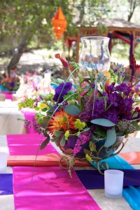
 An Indian wedding allows for bright, vibrant colors to be used. This has to be one of my most colorful weddings. I loved the purples and magentas. You can see that the gold linen and centerpiece container, as well as the colors of the flowers and the runners tie everything together.
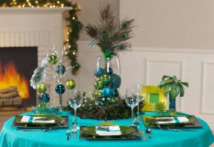
 Whatever you do, don’t be afraid of color at your wedding. A pop of color in a linen or napkin can totally make the look of the room/area. A perfect example would be my cousin’s wedding. She wanted to use brown linens. I insisted, yes insisted we use teal. Another color in her scheme. Check out the room all DIY by us. Can you imagine this room with brown linens? Dull.


